Showing posts with label color. Show all posts

Thursday, March 17, 2011

Art Review: Light! Color! Action! by Ramon Soto at the Children's Gallery

Opening the door to the Children's Gallery is a treat for the next few weeks! Your eyes will feast on Ramon Soto's exhibit, Lights! Color! Action! while your brain will try to puzzle out "how did Ramon do that?!"
With so many beautiful prints, how do you pick one?
Indeed, just how did Ramon make these digital prints he names Light Abstractions? The colors are splendidly brilliant against black backgrounds. The patterns are mathematically challenging, unique, and playful. Some how, some where, Ramon found the photography equivalent of a Spirograph set. When you play with a camera at night, these are the images you wish you could capture!

If you passing through Homestead, Florida, this a fun exhibit to view! Share your imagination on what you see in the digital photos...there are plenty of stories and patterns!

For more about Ramon Soto, please visit his website or email him. All images are ©Ramon Soto.

The exhibit Light! Color! Action! by Ramon Soto is open from March 12th through April 9, 2011 at the Children's Gallery of Homestead, Florida. For hours and information, please contact the gallery by telephone at 305-224-9386, website or by visiting 51 North Krome Avenue, Homestead, Florida, 33030.

Light Abstraction I
Peeping through the window on opening night.
R-L: Photographer Ramon Soto with Natalie Prieto of the
Children's Gallery and friends Isabel and William.
Dancing demonstration by Aida.
Light Abstraction VII


This is a review of the exhibit Light! Color! Action! by Ramon Soto. The opinions and views of this review belong to Angeline and solely express her opinions.


PS: Happy St. Patrick's Day!


Smiles, 
Angeline Marie of 
Angeline Marie Fine Art
Facebook Page for Angeline Marie Fine Art


Please consider sponsoring my upcoming art exhibit with Jason Eldridge, May 7th, 2010. 


Sunday, December 26, 2010

Video: How 1 Artist Sets Up Acrylic Paints in Studio


This video is 2:31 minutes. It is virtually unedited. It answers at least part of Jason's (of Eldridge Studios) questions...the rest of his questions are for other blog posts.


If you have questions, please feel free to leave a comment. 


UPDATE: The contest with the theme of January has four entries and two themes:

1. The End of the Past (from JJ)
2. New Beginnings (2 times, from Bianca and Rosie)


Smiles, 
Angeline Marie of 
Angeline Marie Fine Art

Friday, December 24, 2010

Merry Christmas y Feliz Noche Buena!

Merry Christmas and THANK YOU to all for supporting artists, reading this blog, and commenting on art, photos, etc. here and on Facebook. These are gifts that last the year, and to you, THANK YOU!

To all my Spanish friends and family: FELIZ NOCHE BUENA y PASCUAS!!!!

To all my non-Spanish friends and family: MERRY CHRISTMAS!!!!

Poinsetta Sketch using Tombow Dual Brush Pens in Sketchbook, 2010, 5x3 inches, ©Angeline

Smiles, 
Angeline Marie of 

Friday, September 3, 2010

0 Planes, 1 Train, 2 Up on a Motorcycle - Adventure

Here is the ADVrider Ride Report link - this will have photos, comments, etc. Andy. You do NOT have to have an account to read the ride report:
CLICK HERE

Here is the Spot link - this is the map that shows where we have been already:
CLICK HERE

I am working on getting an online image account to upload some of my photos. Most of my photos are not to the level of Jason Eldridge, but they are mostly meant to be for art reference.

SPECIAL NOTE: You are invited to Coconut Grove's Art Stroll on September 4th at Dharma Studio! I will have a some of my art work on display there, from 7pm to 10pm! For more information, please visit my webpage and/or my blog page about the event.

Comments on this blog are welcome! Feel free to visit some of the past blog posts, too. Your comments, questions, and ideas are always welcome here, and you will receive a response.

Thanks for visiting! Smiles,

Angeline Marie of
Angeline Marie Fine Art


Tuesday, July 13, 2010

Art in Unexpected Places - Indianapolis Airport

Indiana Flight by Martin Donlin (poem by Joseph Heithaus) Handblown glass with acid etching (#32 in brochure)


In my travels, I have noticed that airports, including Miami and Fort Lauderdale, try to have artists display their work in their concourses. This time, the windows in the Indianapolis Airport were decorated with splashes of color, the above photograph being the center piece of the area Andy and I walked. Most of the art in Indianapolis was evenly distributed between secured areas (concourses) and public areas (before security checks). At Guest Services, there is a hardcopy of the brocure available to check off while you walk. That was a great and friendly touch by the designers of that airport!


The next photo shows the poem that was in the display. The simplicity, brightness, and saturated color just caught my imagination. The words are just icing. 

Most of the art in Indianapolis was evenly distributed between secured areas (concourses) and public areas (before security checks). At Guest Services, there is a hardcopy of the brochure available to check off while you walk. That was a great and friendly touch by the designers of that airport! Thank you to the Guest Services counter and the Concourse A's Security Personnel (who allowed me to get a few photos of "Autumn Prairie Morning" without too much fuss).

Take a look around you while you travel. Art shows up in unexpected places: airports, small thrift stores, out of the way small shops. Art shows up while you visit monuments, shopping malls, and historical sites. Notice art. Enjoy art. Stop and see it. I did - these photos of the many I shot during my vacation are just a sample. 

Because of this post, I learned that the Indianapolis Airport has art throughout and has an online guide for those who enjoy it. After my signature, there are a few more photos that I shot around the airport. This was the art show I wanted to sneak into the trip, and it was well worth the walking!

Do you have a favorite memory of where you were startled by art? Where was it? What were you doing before you noticed it? Share - so everyone can find it, please? 

Smiles,
Angeline Marie of


Chrysalis by James Wille Faust Painted canvas and sandblasted glass (#3 in brochure)


Night by Ann Gardner Glass tile, aluminum leaf and imitation gold leaf


Detail of Autumn Prairie Morning by Dixie Friend Gay Glass tile

Sunday, July 4, 2010

Get Some Color!

We are quite spoiled these days in terms of color. Colorized movies, clothing, housewares, etc. are normal for us. Crayola crayons have existed for over a hundred years, believe it or not. Most homes have paint instead of wallpaper and paint is found in the hardware stores.
About 150 years ago, most artists had to mix their own paint. Clothing had colors, but natural dyes were used most of the time. Photographs were colored after the fact because black and white or sepia were the norm. Color was from natural products. 
Sometimes, I will use natural things for colors instead of what I purchased in the stores. There is a subtleness to those colors, the interesting way the colors change over time that still add to the painting or drawing.  Flor has real pollen from the actual lilies used as still life. That is the yellow/brown in the painting. Cafe cubano, instant coffee, tea, berries, wine...all have a natural dye. I think I've used all of those things in my paintings at one time or another.  
My favorite painting with cafe cubano is shown is this post. Forgive the pixelizing of it, because the digital photo was from a 3.2 megapixel camera (remember those?!) The next post will share the story….
Eagle's Fly By - 2006 - mixed media on paper - 23 x 33 in.
Smiles,
Angeline Marie of
Angeline Marie Fine Art

PS: Happy Independence Day! Remember - freedom has a price, remember those who pay for it so that we may all enjoy it!

Related post: Lucky 13 Surprise Materials

Tuesday, April 27, 2010

Florida may not have Mountains...


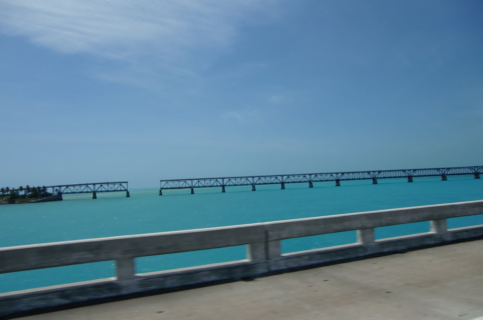
This past weekend, Andy and I had an adventure to Key West on his BMW motorcycle. Most of the talk in biker groups is about twisty-turny roads, mud, mountains, switchbacks, hills, and stuff that is difficult to find in Florida.

So, Florida does not have mountains. Artists and photographers seem to have a similar gripe: but everything is flat! straight! boring! Boring? What? 

South Florida has COLOR. Blasting COLORS: hot, delicious, juicy COLORS. South Florida has clouds that are unbelievable and fantastic in shapes, sizes, and compositions. Blink, and it is for the scene in front of you to change and shift. Ok, it helped that I was on the back of Andy's motorcycle with the camera, but really Florida can change that quickly. 

These are some sample reference photos for future art shot this past weekend. They are all about the fun and colors. 

Smiles!
Angeline Marie of

Thursday, January 28, 2010

Audience Participation Requested! First of ???


I would love your help with this semi-fantasy piece. It keeps telling me it needs more…but I am not sure what.

What do you think about the following:
The colors?
Placement of the horses?
Do you see any horses that I have not brought out in the painting?
If there is something that bothers you or is missing, what is it?

Truly, I appreciate your help. I started this art work with a canvas that used to be a palette. While I was smearing paint on this canvas for work on another, I say the horses in the right top corner. I stopped, looked at the canvas with a mirror, and found the other horses.

Now, it’s your turn to help the direction of this painting…because I’m stuck!

Thanks & smiles!
Angeline-Marie of

Friday, October 16, 2009

Hot & Cold Figure Painting


This one was done in September of this year. The idea was to capture the darks as cool colors and the lights as warm. Because I feel overwhelmed sometimes with color choices, I severely limited my palette to white, yellow, and blue. Yellow for the lights & warm areas, blue for the cool and dark areas. The white was to obtain values. Pure color of yellow or blue was used to get the darks. The painting is about four feet high by two feet wide, done on imported Russian paper with acrylic paints.
The story about it is that I get to work from a live figure model twice a month at Ismael's studio. I am truly enjoying the sessions. The poses are beautiful, the lighting very interesting. I am enjoying it so much, that lately it's been difficult to go back to landscapes, etc.

Smiles!
Angeline-Marie
www.angelinemarie.net

Friday, August 28, 2009

Bed Pieces Project 4


Today I've spent a few hours in my studio with the bed pieces & have become very scared and fascinated. Scared because I want & crave my client to love these paintings. Fascinated because my colors (palette) seem to be changing again to what perhaps she does not prefer.

My client wants sunset/sunrise with a lot of green palm trees. Lucky me, I enjoy painting palm trees, but they are not always green. Visit my webpage, www.angelinemarie.net, and you will see what I mean after you click on the header link to "Palm Trees."

Green. I painted in the sunrise. WOW. HOT, BOLD, FUN, FRESH, POPPING COLOR! Florida! I love this gushy, YUMMY color! Whoa, now, my client wants green. Where did the green go? I don't care about the green - I love the sunrise effects! Grumble, grumble, ok, I will tone down the sunrise & paint in the palm trees greener again. This, friends, is the palette change.

My "Second Mom" unexpectedly passed away in January, 2007. Shortly thereafter, not even a week later, my colors abruptly changed to moody, tonal, and somber. The bright colors seemed to have left with her, no matter what wet paint I poured onto my palette. The colors would mix into darker and sadder tones although my energy remained. I digress from the project...but now that it's August, 2009, it seems that the brightness wants to return!

Did it have to happen in the middle of this project?????!!!!!!!!

Standby this weekend for more adventures while I laugh until my sides hurt,
Angeline Marie
www.angelinemarie.net

Thursday, August 27, 2009

Violin Project - OOOOOPS


Sometimes, there are OOOOOPS on projects. I had to repeat the following mantra last night: "DO NOT work on any art projects while super-duper TIRED. Repeat." I attempted to begin the violin last night...and had a very HAPPY accident.

I know what theme I want for the violin. I know what colors I want, too. I thought I wanted the entire violin painted, but the wood is too pretty to cover up completely.

I began by masking off some of the violin with painter's tape. Took the violin outside to spray paint. Read "Do not use spray paint in high humidity" and laughed. I live in Florida, where it is always humid. It'll be fine! Yeah...when the paint pooled around the edges, and the drips were extremely runny and the panic set in, the newspapers were grabbed to mop up & take off the paint.

As you can expect, the paint truly did not come off completely. The violin wood's finish is so glossy, that most of the paint didn't even adhere to the surface. Zach, someone who knows a lot about industrial paint, was almost called to aid me. The newspapers actually left behind a very cool effect, which I believe is going to be repeated with different colors.

Since pictures are worth more, I thought the effects left behind by my OOOOOPS are actually very cool. Reminds me of water, and how I love paint's application on wet paper.

I'll be happily, merrily, singing my way on this project & more this weekend. YIPPPEEEE!

Smiles!
Angeline-Marie
www.angelinemarie.net

Wednesday, August 26, 2009

Bed Pieces Project 3

It's been a looong time since updating anyone about this project. So much as happened since it began!

At long last, I was able to visit with the client to review the small pieces that were about 1/2 done. This was a learning opportunity for the both of us!

My client & I reviewed my website for good examples of what was preferred for colors & composition. She decided that she wanted more green in her paintings than in the two she chose as her favorites. This truly helped us clarify what we expected from each other as far as the completed art pieces.

We wrapped up the consultation with how she wanted to "frame" each piece. I had masked off the portions that were not going to be painted, and wanted to make sure that is what she wanted. Other than one adjustment, it was what she wanted.

Smiles until the next update!
Angeline Marie
www.angelinemarie.net
ammtz2008@gmail.com

Saturday, August 15, 2009

When an Artist Judge is GREAT!

All artists know the drill: you enter an event with your art, and you are rejected or accepted. Each time, most times, the artist has to guess as to why he/she was accepted or rejected. Judges don't have the time to explain.

Sometimes, things are different. I love doing plein aire events, a.k.a paint outs a.k.a quick draws. I have had two great judges of events, and I must say it was not because I placed in the event. It was the judge took the time either before or after presenting awards to speak to all/most of the artist participants. The judge that stayed around instead of rushing off to some other place and never letting us meet them.

The first artist, Beth Ravitz [www.bethravitz.com/], explained how she chose the awards. Beth chose each for not just beauty and color, but also took into consideration the individual styles. She chose not just realistic "photographic" art, but also impressionistic and almost abstract works. She wanted a cross section of the best of each type of style. Beth took the few minutes and explained that to the group. It's been about 3 years since that Pinecrest Gardens event, and I still remember her!

Today, it was Gregory Little [http://www.gregorylittle.com] who took the time after judging to speak to each participating artist. He took the time to give me what was great about my art piece [based on Harrison Street, Hollywood, Florida] and what could be improved the next event. He was aware that I had some experience painting outdoors, and little painting street scenes and buildings. Greg took a few minutes to review these things, and he will always be remembered by me.

Both Beth and Greg's links are included in this blog post. Go see their art - their art is incredible. I am honored to have my art judged by both artists!

Smiles!
Angeline-Marie
www.angelinemarie.net

Wednesday, July 29, 2009

Sea Star Glass - Fused Glass Art

For a while now, I have bought jewelry from a local glass artist named Dafne. Most people who know me know I'm not big on jewelry, other than rings. She changes my mind. Dafne's stuff is not only artistic, but beautiful, functional, and wearable.

I have a pendant on a simple silver chain. It has waves of blue, black, and silver. I love that piece. It has little bits of gold, red, yellow, and green. The abstract design looks like a sail boat on the ocean at sunset or sunrise.

Most of Dafne's designs are accidental because of the glass fusing process, so that even if the design is planned, the element of surprise exists. However, of all the glass fusing artists I have seen making jewelry and other items, Dafne's planned accidents are the best. She has the most color, the most pleasing compositions in her glass. I cannot help but look when I see fused glass, and each time I walk away wishing that artist was a good as Dafne.

Check out Dafne's website at http://seastarglass.com and drop her a contact.

Until the next time,
Angeline-Marie
ammtz2008@gmail.com
www.angelinemarie.net
Related Posts Plugin for WordPress, Blogger...